Some thoughts on use of color inspired by Olympia Mytilinaiou´s Workshop
Olympia Mytilinaiou´s workshop provided important knowledge on the construction of imagery in a film and what a critic is supposed to keep an eye on while watching a cinematic piece. One of the aspects of film imagery we discussed was the use in color as a tool for manipulating the mood in the frame. As Olympia Mytilinaiou implied, orange and blue are the most utilized colors in mainstream films respectively in comedy/melodrama and thriller/horror genres. However, there are numerous other ways in which language of color is being used in film when it is not simply an entertainment mean. In this regard, I would like to use Olympia Mytilinaiou´s talk as a starting point to discuss the use of colors and particularly their nuances in one of the awarded films at AltcineAction! – Diving-In by the young Slovenian director Simon Intihar.
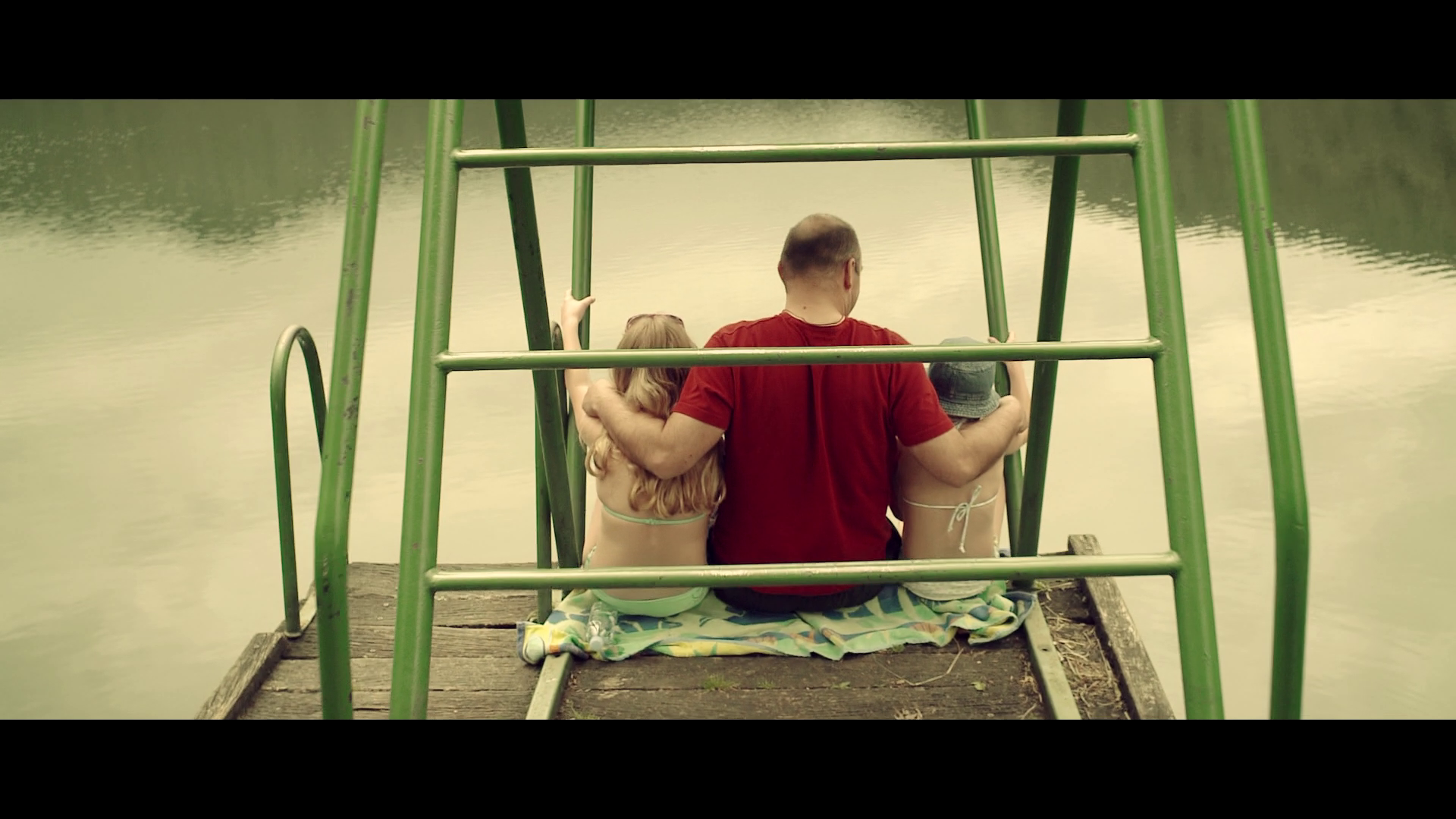
In general, the color palette of this family drama which delicately reveals a tragedy in the past caused by the death of a child due to its father´s fault, is in the calm and melancholic green-yellowish scale with some smooth nuances of blue. The main character wears a red t-shirt throughout the whole film which contrasts with the overall greenish surrounding environment. Considering this fact, I would assume that such a choice reflects his internal conflict with the external environment – his ex-wife´s attitude towards him is rather reserved, even hostile due to their traumatic history as a family, while his daughters express either distrust (older daughter) or dissatisfaction (younger daughter). Therefore, in this case we have a complementary pairing of red and green in order to juxtapose the anxiety and nervousness of the father (red color as a symbol is associated with anger, passion, rage, desire, excitement, energy, speed, strength, power, heat, love, aggression, danger, fire, blood, war, violence) to the melancholy and peacefulness of the environment (green usually symbolizes healing, soothing, perseverance, tenacity, self-awareness,, unchanging nature, environment, health, renewal, youth, vigour, spring, generosity).[1] Thus the attention in the frame is attracted on the father who triggers the action as a protagonist. Throughout the story development, the green palette of the mise-en-scéne moves from pale towards some fresher and more lively nuances not only because the action goes exterior but also to synchronize with the plot as it is getting closer to reconciliation. While the interior scenes from the first half of the film (in the house or in the corridor through which walks the mother while checking the father on the phone) are designed in the cadaverous green-blue range, the brighter yellow-orange nuances penetrate the green towards the end, when sunshine is about to lighten the tough relationships in this ex-family.
Director Simon Intihar and cinematographer Blaž Potokar demonstrate experience and visual literacy, implying the message of their film in an unobtrusive way, by using complementary juxtaposition of colors but also by gradual development of the nuances in the background green color. Thus they emotionally direct the audience towards the factual resolution of the film conflict on screen.
[1] https://www.cinema5d.com/film-color-schemes-cinematic-color-design/