A reflection on Olympia Mytilinaiou’s masterclass that turned into an impromptu review
In 2013 I was in a film journalism workshop at the Venice Film Festival and everybody in my group was talking about this amazing Greek film screening there. I didn’t manage to see it then and it’s bizarre title, Miss Violence, so full of promise and potential cinematic pleasures, stuck with me. Three years later, I find myself in another workshop, Altcine’s the 5C Project, listening to Greek DOP Olympia Mytilinaiou talk about the different approaches to cinematography: the natural approach and the artistic approach.
The natural approach is when the camera functions as a medium for a story. It’s purpose is in fact to make itself invisible. Think of literature for the perfect analogy: when you read something, you don’t get distracted by the shape and size of the letters or their color. With the artistic approach cinema draws from it’s other important relative, painting. The narrative of any painting is one that can be read in a couple of seconds; most of the times it’s just a pretext and other times it doesn’t even exist. Here, the means by which the information is transmitted become the purpose: color, perspective, detail, even texture. When cinema goes in that direction, the image itself becomes more important than any other part of the film. I am not talking about those ”pretty picture” films (sunsets, white horses and landscapes etc.), but about films where the quality of the image is elevated beyond that of the subject it is capturing. These are the extremes (which exist only in theory), and between them lies the balance that Mytilinaiou stresses: cinematography needs to work with the rest of the elements to enhance the story/ idea/ theme of the film.
Of course she was the director of photography for Miss Violence, and of course the opportunity was missed because I still hadn’t seen the film. Having no example at hand, I didn‘t even have a question, more a desire to know that I formulated in the lines of “as a film critic, I would like to learn how a cinematographer goes from story to desired effect in the spectator, what tools (s)he needs to use and how”. Basically, I wanted to understand why a certain image (going beyond the reality of what is shown) affects me in a certain way. She didn’t agree (and we disagree on that) because, she said, a critic doesn’t need to know how it’s done, a critic should focus on the result (the feeling), and try to convey that feeling (through writing, therefore literature) to the reader. While that is the critic’s job, it always helps to know more, to understand the visual grammar at work. Not only does this knowledge enhance your skills in terms of translating the feeling to the audience but, sometimes, the cinematography may work with such subtlety that you miss it. The result is a feeling you can’t explain or trace back to an intentional element in the film. Other times, the cinematography works not with feelings, but with intellect (for instance, a film is trying to replicate a certain style or author in painting), if you are not aware, you miss the point.
I finally saw Miss Violence and was blown away by the film’s cinematography, from concept to execution (though I’m sure director Alexandros Avranas was also involved in coming up with the concept). The quality of cinematography here may be somewhat hard to comprehend at first because, as Mytilinaiou puts it, the approach seems to be the natural one, serving that type of austere realist cinema that eludes any kind of beauty (because it would draw attention away from the story or because it would mean reality was molded into an artificial form). Coming from a country that has become a successful breeding ground for this kind of cinema (the Romanian New Wave), I can clearly say that Miss Violence is a very different thing, though its aestheticism is hidden by it’s (somewhat) formal use of the natural approach.
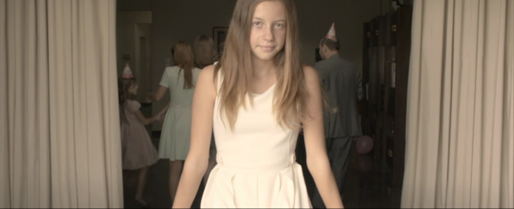
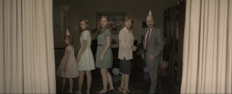
There is an eerie symmetry in a lot of the shots, and certainly in most of the static shots: the character/ characters always seem to occupy the exact middle of the foreground, the distance from them to the edges of the frame equal (left-right and up-down). This comes with a somewhat flattening effect, augmented at times by the use of props that make the shot a frame within a frame. The static camera, the static characters, all this connects with the odd use of the Polaroid camera, an item that stands both for a past affluence (when the family was prosperous and, perhaps, happy) and for a thin mask of normality that can cover all kinds of traumas (don’t all families seem perfect in pictures?). Take a look at these two frames from the opening sequence.
Look at the perfect symmetry of the composition, the curtains framing the “family photo”, the birthday hats (one in the middle, two at the edges), the brother in the exact center of the picture, the layered depth of field of a shot that is ostensibly flat (the girl in the foreground exits the frame to reveal the middleground and the brother in the background, stuck to the wall with his photo camera, like the proverbial fly on the wall come to spy on intimate matters). Though it’s not so evident in this shot, the color scheme of the clothes and the décor is also strictly controlled. On a subliminal level, though this is of course a choice of the author (director, DOP, art design), all this symmetry becomes also an expression of the authoritarian father figure: always dressed as if for the office, always controlling, putting things and people in their right places, matching their clothes. Look at the old couple on the right and the little girl on the left, their shirts and her dress match the curtains perfectly, they fit in. The young woman (dark green) and the older girl (light green) stand out, they are the cracks in the family unity, the most liable to let intruders know (or to draw attention unwillingly to) what’s going on behind the curtains.
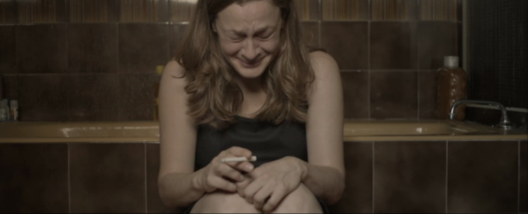
In the next frame we can see how another character melts into the background, like one would do when trying to sneak around, not to be seen by the guardian of this prison.
Same type of center framing, same flattening effect, only made more evident by the chromatic monotony: all brown and beige and skin tones, even the black dress seems to melt into the surroundings, with only the cigarette standing out.
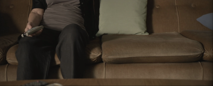
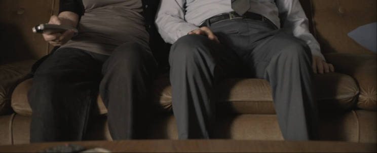
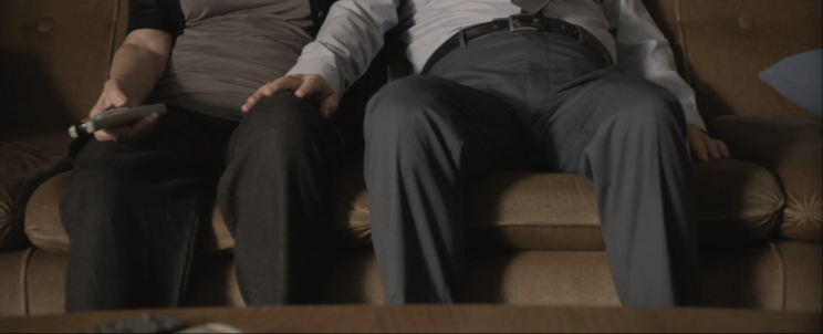
Finally, this last shot is simply brilliant (and it’s beauty comes also from it’s simplicity), because it delivers three things simultaneously: aesthetic of the image (with a plus because of the unnatural subject of the shot), information that moves the narrative forward and, along with that information, a serious visceral reaction on the part of the spectator.
The shot starts out with an unusual lack of symmetry for Miss Violence, but the empty space will soon be filled. We’re roughly 20 minutes into the film, and it’s been made clear that dubious things are going on inside this family, though what exactly is still a mystery. The body in the picture is, we know for sure, the mother of the young woman. We have been lead to believe that the man is her son-in-law and that the others are his kids and her grand kids. There is a lack of interaction between her and the man, and we can almost read the background of this relationship, and its a tense one. We feel she is somewhat spared his authoritarian regime by that kind of respect in-laws carry in patriarchal societies; the man is menacing even towards her, but she has the wisdom to keep out of sight, and the fake dignity of the one who refuses to see the abuse (if you ignore it, it ignores you).
Then the man stands next to her, and the awkward framing gets obvious, we are acutely aware that the framing is unnatural and the film wants to focus our attention on a particular aspect. There has always been a distance between those two, the mother-in-law and the son-in-law, and the way they sit now, their bodies almost touching, is ominous. There is a small conversation about the daughter/ wife and then Avranas delivers the blow.
His hand on her leg, their pudgy bellies rising and falling rhythmically, the frame has now become shocking and obscene, without actually revealing anything. What makes the stomach churn is the casualness of the gesture and the minimalist delivery of this hint at disturbing sexuality . We are left to digest this sudden development for a few seconds. Then we cut to a close up of the woman and we can tell from her reaction that there is nothing weird going on. In fact, what we have just seen is an expression of the only socially acceptable relationship going on in that house: he is in fact her husband, the young woman his daughter, her grandchildren are also his. This shot is not accidental, it’s been a magic trick all along, a deliberate confusion set up for the audience to receive this blow, which is then quickly explained to make it seem like a false alarm: all of a sudden, the kids and the young woman start calling the man “dad” and “grandpa”.
In fact, I am almost certain that they used different lighting, and maybe even post production color grading, to make the grandfather look younger in the beginning (his hair and beard made darker to fool the audience into thinking he is the father). I wished I’d seen the film before the masterclass, I would have asked Olympia Mytilinaiou if and how she did it, and that is the moral of this story, always come prepared.

